Our goal was to transform Pink is the Colour into a living campaign hub that inspired action and felt seamlessly connected to the newly rebranded McGrath Foundation website. The redesign needed to do more than look good, it had to tell a consistent story, aligning with McGrath’s updated visual identity while making it easier for users to engage. We focused on creating a smoother, more intuitive journey for supporters to start fundraising, donate, or get involved, all while capturing the energy and warmth of McGrath’s expanded mission into all cancer care.
We approached the redesign as a way to connect the dots between campaign energy and brand integrity:
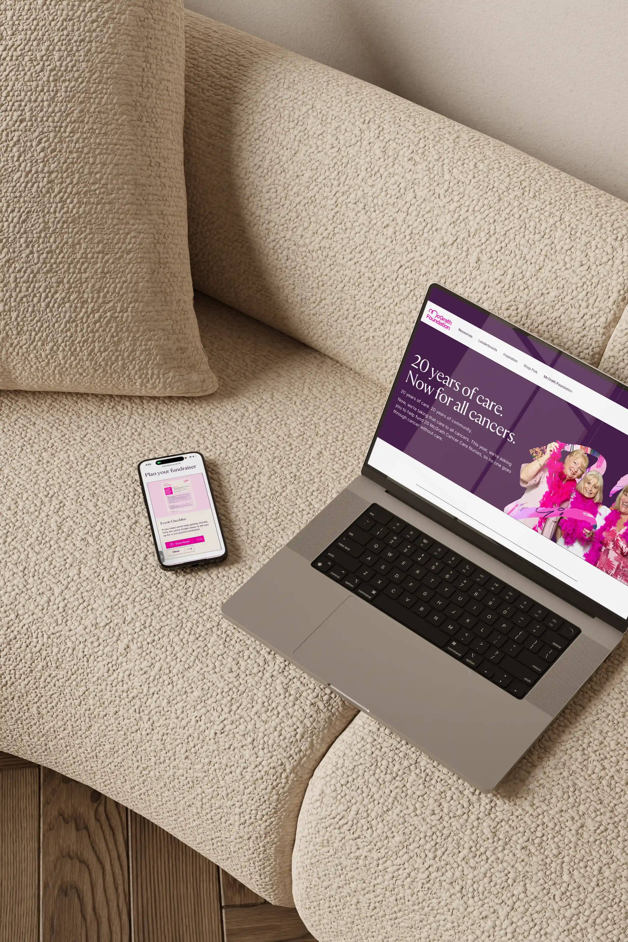
The refreshed Pink is the Colour website now feels like a cohesive extension of the McGrath Foundation’s new brand, energetic, modern, and deeply human. Beyond the redesign, we helped build a platform that empowers the community. Every fundraiser now has a central place to access campaign resources. From ready-to-go social media assets and editable document templates to digital invitations, blog articles, and stories from other fundraisers for inspiration.
We also designed the site to include campaign-specific leaderboards for initiatives like Pink Stumps Day and Pink Up Your Town, giving fundraisers a sense of friendly competition and recognition while showcasing the collective impact of the McGrath community. The site doesn’t just guide people to start fundraising, it gives them everything they need to feel supported, motivated, and proud to be part of something bigger.
The result is a campaign hub that unites community, storytelling, and brand consistency, strengthening McGrath’s voice and helping drive their expanded mission to bring care to all cancers.
%402x.svg)
This isn’t just another discovery call. It’s the first step toward a brand that doesn’t just exist, but commands attention.
Let’s build something that people remember.
%402x.svg)

